Tuesday, June 21, 2011

OW SON OF A ****

Aieeeeeeeee, just pulled off an industrial strength sticky plaster, plus my brother and a local boy are taking off a road safety ad behind me to make matters worse, (I told them not to be pricks and they've shut up - neat.)  Any how, In the interest of keeping the gears of thought in motion I decided to make some illustrations based on my friends, the three amigos, Barry, Cian and (my extra friend) Finn (in alphabetical order to be diplomatic). I got the idea after Finn said something about Barrys polo shirt, Cians V neck and his own tshirt. (On reflection it turns out Cian doesn't wear all that many V necks but, I suppose it's more the spirit of the V neck if you will?.. Oh god what am I saying???)  So this template gave me the idea for two more illustrations. One is based on eyesight, Barry has perfect "20 20" vision, Cian is far sighted and Finn is near sighted.


The last one is based on the common factor that brought these musketeers together, the art college! Barry is a promiscuous printer and Cian and Finn are fellow graphic gowls. (Two points of interest - one is that Barry came to LeSAD set on graphics but hated it! The other is that I do not approve of the gowl moniker, I wasn't consulted.) Anyhow, even though Cian and Finn are both Vis Com, they have different approaches. Cian can draw, Cian can draw very well, Cian can draw so well people ask him to draw on their shoes!! (Cian draws on his plimsolls, word gets round!) On the flip side Finn is a mac prodigy, he already has an impressive portfolio of paid work and we aren't even in second year!!!

So yeah! I had to spend a while creepin facebook photos to check frame shapes and such but it was a fun wee project, I must keep them up!

Thursday, June 16, 2011

NEAT!

Make-it-RAIN!!!!

My first ever paid commission! Last week my main man Keith Hogan ( or Hogey Bear on account of the fact he hooked me up... Does this reference still make sense? It did at 4 o'clock today...) put me in touch with a friend of his, an event manager called Tim Carey. Tim is promoting senator David Norrises presidential campaign and one of the events he organized was an "alternative fashion show" to raise funds. The alternative aspect is that the models are going to be be drag queens and lady kings! (I had always said drag kings but lady kings sounds nicer!)


So Tim needed a logo and he gave me fairly clear instructions, the event is called Divas V Demons and he wanted a contrasting girly Divas against an evil Demons.  So that's it up there, Tim was pleased so he asked me if I wanted to take a crack at the poster. First of all he sent me his first attempt, which as he said was constructed in the dead of night in a caffinated-sleep deprived haze so don't judge him on it!

Sooooo... I said I'd take a crack at it! (Well actually I said something about a bag or oranges... make of that what you will.) Below is my poster, I changed the bevel on the logo because the deep channels didn't work against the background. Also, spot the typo! (I didn't convert the finished one so this one has one small mistake.)


It's a milestone for me, my first paid job! Plus Tim was so pleased he said he's got a few more projects lined up for this year that he'd like me to work on, neat! (again!)

Monday, May 23, 2011

What happens when you set a class of bitter, sarcastic and disillusioned graphics first years a brief which forces them to put a positive spin on a country whose main features are it's alcoholism, its unmerciful rain and its crooked political system?

THREE WEEKS OF BELLYACHING!!!

The brief - Positive Ireland. We had to design a cohesive campaign which included a billboard, a t shirt and some kind of freebie - give away promotional item.

Oh LAWD.


Thankfully, three days into my misery I received a visit from my muse and savior - Hazel Egan (who, as you might remember from previous posts once accompanied me to the emergency room for stitches and humiliation.). Hazel has many stories of her familys' various encounters with deer and is a person who I would always associate with wildlife (her sister calls her badger.). I've always loved animals too (kids in primary school used to call me Mrs. hibernation, and less creatively... freak of nature...thanks guys...). So that gave me my hook: Ireland - Wild at heart.


So I finally had my area of interest and was able to batter on from there. My concept was that both native Irish wildlife and Irish people share positive traits, and that various animals represent different specific traits.
So I started to research facts on 5 different animals which I picked based on their distinct physical features:

Red Deer - Antlers
Badger - Claws
Peacock Butterfly - Wings
Red Fox - Tail
Rabbit - Ears


And then began the long ARDUOUS and ultimately POINTLESS process of trying to pair my research with a series of illustrations I drew. I say pointless because they were all eventually eschewed for green filtered images of Irish celebrities who  embody the traits associated with each animal:


Red Deer - Olivia Wilde (A beautiful Irish actress, she appeared in the movie TRON and the t.v series house)
Badger - DJ Carey (A kilkenny hurler regarded as perhaps the greatest of all time)
Peacock Butterfly - Rosanna Davidson (Rose of Tralee who went on to win Miss World, also her dad is Chris de Burgh... good for her)
Red Fox - Ryan Tubridy (Late Late Show presenter)
Rabbit - Jedward (... cultural phenomenon)


So the billboards were paired with the freeb - the "Wild at heart" personality test. You answer questions to ascertain which animal you are most like. You then receive a costume item based on the animal.


So.... yeah, take the test, unveil your inner beasht...

So all in all it was a difficult project but - but - the future will be paved with difficult projects and I must fortify myself like so many turtles...

Thursday, April 14, 2011

HOLY SH*T ITS UP THE WALLS!! ... OH GOD IT'S GONE OUT THE WINDOW!!!

Done, done, I am finished with theoretical physics, a3 vs. a4 printing, GRIDS, pharmacies, thermodynamics,  baking soda, Tupperware, the laminator and clocks, DONE I SAY!
On Tuesday we turned in our final design solutions for the ranking project:


There's my research folder, my book covers (one on the wall and a copy on the dummy book) and part of my conceptual book.


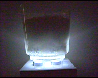
 Part one of my conceptual book is the ingredients for a "bathbomb". It's a fizzy tablet, like an alka seltzer or a berrocca that you can drop into your bath to create the illusion of an extremely shoddy jacuzzi. To make one yourself all you need is one part citric acid (you can get this in pharmacies and it's far less dramatic then it sounds, also you can use it to make sherbit!) to tow parts baking soda. You bind the two by carefully spritzing on witch hazel (also from pharmacies, its a good toner for your skin!), I say carefully because if you add too much it starts the reaction between the acid and the soda. Then you pack the mixture into your mould and let it dry overnight. 


So in my kit there's all the ingredients, a mini bomb, a tub to mould it into, some stirrers, and of course safety gear (including 3d glasses, very appropriate to the dimensional theme! I also related each ingredient to a particular dimension, the idea being that once combined, they'll create the fifth dimension, the tesseract! 


Above are stills from the video I recorded of  my tesseract in action. I made one about the size of a shoebox and inside I laminated the chapter which explains tessering. Y'see tessering is how you use the 5th dimension to travel, you'll disappear in one place and re-materialize in another, so when my "book cover" fizzes away, the pages will appear, disappearing, reappearing, see what I did there?

So the whole production went off better then I could have hoped for, nothing spilled, the block foamed up in a timely fashion, the pages stayed watertight, the lights worked nicely. In fact things worked a little too well, the universe was displeased with my non-failure and decided I would have to bathe the ladies room in 10 liters of discount sprite just to put me in my place. I am very sorry about our now lemony/sticky ladies room....

END.

Saturday, April 9, 2011

Finnished...no wait...Now I'm finnished... NO ok ok I'm REALLY finnished this time!!

Aieeeeeeeeeeeeeeeeeeeeeeeeeeeeeeeeeeeeeeeeeeeeeeeeeeeeeeeeeeeeeeeeeeeeeeeeeeeeeeeeeeeeeee, I think I'm done... I hate being done, I mean I like the end of work and all but isn't there that adage about a work of art never being finished, just abandoned?? Then again, if I can't accept my own work how am I ever going to persuade anyone else to??
So for my final solution I decided to develop the image of the polytrope. It's a delicate and attractive shape and I think it's an interesting way to represent the 5th dimension, which is pivotal to the book.


First of all I looked at combining it with the folded clock idea, I liked this one because first of all I think its a strong image and secondly the fold would help to explain the choice of shape to the reader if they were actually to read the book, which is a bonus.


The next idea I worked on was the development from a one dimesinonal line to the 5 dimesinonal poly trope. There are only two illustrated pages in the book and on the second illustrated page there is a drawing of a line, a square and a cube. I developed on this to include a hypercube and the polytrope. I also like this one! Particularly on the white background it reminds me of a poster you might see in a schools science lab, which is perfect for the tone of the book.


The idea that took me up to my final design was the combination of the polytrope and the clock. When I was trying to decide what to do next, John (who's second name I don't know - yet.) suggested that I just use a suggestion of the clock, just the hands say. THANK YOU JOHN!


So above are two different versions of my final design. I like the white one but the reason I chose the colour black was to show that a lot of the activity in the book is done "in the shadow of The Black Thing". Also the reason I chose blue is because I think its appropriate for the hopeful and scientific tone of the book (And its my favourite colour, David Carson said it's important for artists to have favourites. That's my story and I'm sticking to it.
And there we have it! My baby!