Thursday, April 14, 2011

HOLY SH*T ITS UP THE WALLS!! ... OH GOD IT'S GONE OUT THE WINDOW!!!

Done, done, I am finished with theoretical physics, a3 vs. a4 printing, GRIDS, pharmacies, thermodynamics,  baking soda, Tupperware, the laminator and clocks, DONE I SAY!
On Tuesday we turned in our final design solutions for the ranking project:


There's my research folder, my book covers (one on the wall and a copy on the dummy book) and part of my conceptual book.


 Part one of my conceptual book is the ingredients for a "bathbomb". It's a fizzy tablet, like an alka seltzer or a berrocca that you can drop into your bath to create the illusion of an extremely shoddy jacuzzi. To make one yourself all you need is one part citric acid (you can get this in pharmacies and it's far less dramatic then it sounds, also you can use it to make sherbit!) to tow parts baking soda. You bind the two by carefully spritzing on witch hazel (also from pharmacies, its a good toner for your skin!), I say carefully because if you add too much it starts the reaction between the acid and the soda. Then you pack the mixture into your mould and let it dry overnight. 


So in my kit there's all the ingredients, a mini bomb, a tub to mould it into, some stirrers, and of course safety gear (including 3d glasses, very appropriate to the dimensional theme! I also related each ingredient to a particular dimension, the idea being that once combined, they'll create the fifth dimension, the tesseract! 


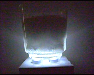
Above are stills from the video I recorded of  my tesseract in action. I made one about the size of a shoebox and inside I laminated the chapter which explains tessering. Y'see tessering is how you use the 5th dimension to travel, you'll disappear in one place and re-materialize in another, so when my "book cover" fizzes away, the pages will appear, disappearing, reappearing, see what I did there?

So the whole production went off better then I could have hoped for, nothing spilled, the block foamed up in a timely fashion, the pages stayed watertight, the lights worked nicely. In fact things worked a little too well, the universe was displeased with my non-failure and decided I would have to bathe the ladies room in 10 liters of discount sprite just to put me in my place. I am very sorry about our now lemony/sticky ladies room....

END.

Saturday, April 9, 2011

Finnished...no wait...Now I'm finnished... NO ok ok I'm REALLY finnished this time!!

Aieeeeeeeeeeeeeeeeeeeeeeeeeeeeeeeeeeeeeeeeeeeeeeeeeeeeeeeeeeeeeeeeeeeeeeeeeeeeeeeeeeeeeee, I think I'm done... I hate being done, I mean I like the end of work and all but isn't there that adage about a work of art never being finished, just abandoned?? Then again, if I can't accept my own work how am I ever going to persuade anyone else to??
So for my final solution I decided to develop the image of the polytrope. It's a delicate and attractive shape and I think it's an interesting way to represent the 5th dimension, which is pivotal to the book.


First of all I looked at combining it with the folded clock idea, I liked this one because first of all I think its a strong image and secondly the fold would help to explain the choice of shape to the reader if they were actually to read the book, which is a bonus.


The next idea I worked on was the development from a one dimesinonal line to the 5 dimesinonal poly trope. There are only two illustrated pages in the book and on the second illustrated page there is a drawing of a line, a square and a cube. I developed on this to include a hypercube and the polytrope. I also like this one! Particularly on the white background it reminds me of a poster you might see in a schools science lab, which is perfect for the tone of the book.


The idea that took me up to my final design was the combination of the polytrope and the clock. When I was trying to decide what to do next, John (who's second name I don't know - yet.) suggested that I just use a suggestion of the clock, just the hands say. THANK YOU JOHN!


So above are two different versions of my final design. I like the white one but the reason I chose the colour black was to show that a lot of the activity in the book is done "in the shadow of The Black Thing". Also the reason I chose blue is because I think its appropriate for the hopeful and scientific tone of the book (And its my favourite colour, David Carson said it's important for artists to have favourites. That's my story and I'm sticking to it.
And there we have it! My baby!

Tuesday, April 5, 2011

Happy mothers day...*hic*

I just wanted to put this up because I'm pretty proud of myself for knocking it up in the throes of the worst hangover of both March and April this year:


Decoupage, its like the crop tool for the reality!
  Mom always says I go to art college but I've yet to make her anything so I decided to rectify that this mothers day. Unfortunately I also decided to get slizzard on apple Smirnoff the night before... ANYHOW, when I dragged my sorry carcass home the next day I was still determined to make the damn card. So with an incriminating blood alcohol level I began wielding my scalpel about my beloved collecting of Sunday times Style magazines (and I'm dangerous with that thing while sober!). There's the result above, a bouquet made from jewelry and flowers and Sarah Jessica Parkers dress!

Mom was pleased!

It wasn't really a card...I made it too big so it was more of a birthday poster....


This is a birthday card I made for my friend Niamh last year in the same style. I love collage because its so easy to combine different elements in a nice stylish way.

Monday, April 4, 2011

Hungry for graphics.. because I had to work through lunch...

I asked for this, I really did. No one forced me to pick graphics, no no it was all my idea... Do I regret my decision? No, not for a minute, I love our little design laboratory in studio 8, great atmosphere, regular dance breaks, everyone has really brought their A game. However - I am not loving this stress, it's the leaving cert all over again! I'm too soft to be competitive, I prefer teamwork! That is not to say that everyone isn't helping each other out in a really cool constructive way, it's just at the same time we all know that some of us wont get through, that's the stressful part!


Anyhow, rant over and on to the actual project at hand, we are designing book covers for a book of our own choosing. I would have loved to have done Alice in wonderland but in the interest of individuality I decided to go for Madeline L'Engels "A wrinkle in time". It's a little sci-fi, a little pseudo christian, lots of mind melting physics and then a big warm message about how everyone has a gift and how love is the one gift we all can give, it's BEAUTIFUL MAN!!!


Tessering for beginners


We have to do a regular cover for sale hypothetically, and then a conceptual book. Right now I'm working on my cover, I had about 55 thumbnails of ideas and pared that down to just 3 ideas.


Folded clock
 The first idea is a literal interpretation of the title, a clock representing time with a wrinkle in it. Not for any particularly significant reason I decided to crease the i in wrinkle and time as well, just because its interesting I suppose!

Paper dolls

The second idea comes from a scene in the book where the three main characters arrive on a planet called Camazotz. The inhabitants are all under the mind control of this evil entity called IT and their behavior is perfectly measured and co-ordinated by it. At one point the children are in the suburbs watching the children playing, all the little boys bounce their balls in sync and the others all arrive out of identical houses to call them in. This reminded me of a chain of paper dolls, as in all these people are all linked together and identical.


Polytrope glasses


The third idea involves a concept central to the book - the 5th dimension. While I was researching this idea I came across some theoretical 4 and 5 dimensional shapes. the one pictured above in the frames of the glasses is called a regular polytrope. The reason for the glasses is that two of the main characters - Meg and Mrs. Who both wear glasses and both travel by "tessering" through the 5th dimension. Mrs. Who's glasses are a feature at several points in the plot because they allow the wearer to rearrange time and space. 


Here is some of the further development of the above ideas. I decided that the first clock looked at little dull for a book aimed at young adults. Diners kind of came to the fore around the 50's and 60's, with those big fluorescent signs. Also the book does deal with a considerable science fiction element so I tried to find an image that might have looked futuristic at the time when the novel was set, but that would still be appealing today.


For the paper dolls I thought what sense does it make to draw the dolls when I can actually cut them out. I swear it damn near killed me, it took 8 attempts! I went with the black background because in the book IT is part of an even bigger evil called the Black Thing, so the background reflects how the people of Camazotz are surrounded by its influence.


I tried to develop the idea of the glasses by first of all experimenting with another theoretical shape, the hypercube. It's such a mind freaker, I drew loads of them and gave myself travel sickness! Anyhow I like the light blue colour because the mood of the book is quiet hopeful, also it's very clean which again I think reflects the books scientific content. So I tried different variations on this theme. I also tried to place the the glasses shape in such a way that the bridge sat on the spine, mainly because I'm trying my best to try and marry the front and back covers.
I think I'm going to go for a combination of the clock and the glasses for my finished design, still tons of work to be done! But I tell you now I am in no condition for work without my lunch and if that ever happens again next year you will see me gazing out the window in ceramics, unfulfilled but with a big sandwich!